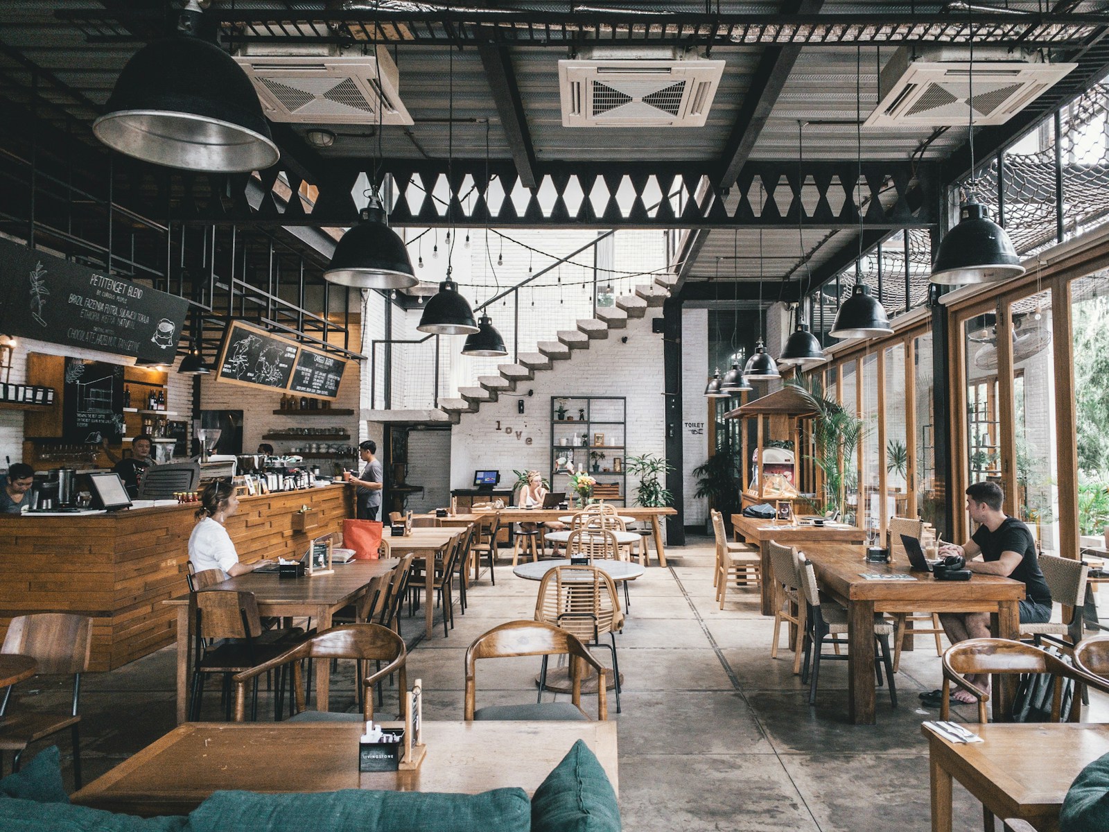
Photo on Unsplash
10 Content Ideas for Restaurant Menu Boards
A blank menu board is wasted real estate. The screen behind your counter has more attention than your website ever will — every customer in line is looking right at it. Here are ten content patterns proven to lift add-on sales, reduce repeat questions, and make your brand feel more polished. None require a designer.
1. Lead with photography of plated food
Studies consistently show that customers ordering from photo menus spend 30% more on average than those ordering from text-only menus. Use a single hero photo of one signature dish — well-lit, on a real plate, taken with a recent smartphone in good window light.
2. Show the daypart you're actually in
Don't show the dinner menu at 9am. Use Showcel's schedules to switch breakfast at 6, lunch at 11, dinner at 17 automatically. Customers see what they can actually order right now, not a menu they have to mentally filter.
3. Highlight one item, not all of them
Don't try to fit your entire menu on one screen. Pick a featured item per daypart — your highest-margin pour-over coffee, your best-selling burger, the seasonal special — and give it 60% of the canvas. The full menu still lives on the printed handout.
4. Add the WiFi password (yes, really)
It's the single most-asked question in any café. Answering it on the screen frees your staff from repeating it twenty times an hour. Customers who connect stay longer and order more.
5. Show your hours and current status
A small "OPEN until 22:00" badge in the corner answers a question every customer is silently asking. Combine with Showcel's clock widget for the current time so customers know how long they have.
6. Cycle through three to five short slides
Don't park one static image. A 3-5 slide rotation, each shown for 8-12 seconds, keeps the eye coming back. Mix product photos, today's special, customer testimonial, an upcoming event.
7. Use video sparingly — and always muted
Short ambient loops (5-15s) of food being prepared, a barista pulling a shot, a steak being plated — these work beautifully. Avoid long-form video and never play sound: customers are talking, your staff is talking, audio competes badly.
8. Keep text big enough to read from the door
If a customer can't read your specials from where they stand in line, the content is invisible. Minimum body text 32px, headline 60-80px. Test by walking 5m back from the screen and reading aloud.
9. Use brand colours, not template colours
Drop your hex codes into the canvas editor once and lock them as brand templates. Every slide pulls from the same palette — no neon-green stock template wrecking your brand vibe.
10. Add weather and time, sparingly
A small live weather widget in the corner adds local relevance and signals "this is live, not a poster". Don't go bigger than 10% of the canvas — it's a flourish, not the focus.
Putting it together
If you're starting from scratch: one hero photo + one daypart-aware featured item + WiFi/hours/weather corner + 4-slide rotation. That covers 80% of the SEO-irrelevant-but-revenue-relevant best practices. Build it once in the canvas editor and you're done.